What an Infograph Should Be
Admin Rating
Infographic Reviews Editor
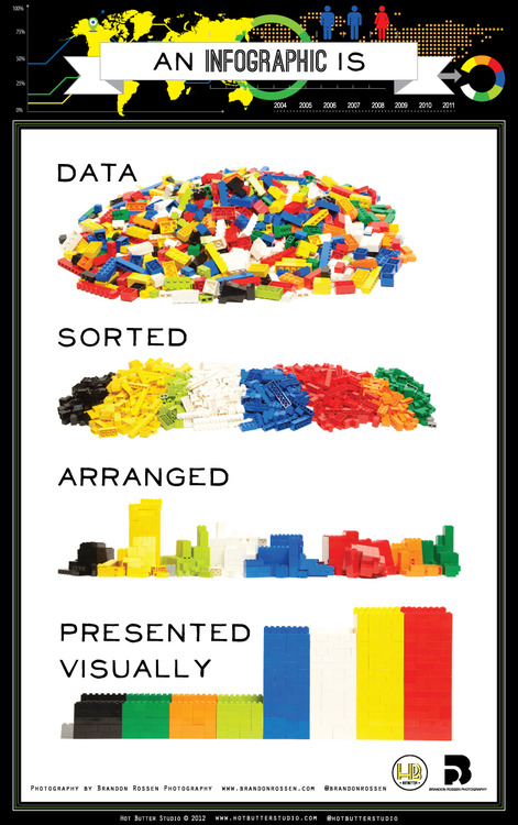
I have seen a lot of infographs. Mostly, they are disorganized and filled of unnecessary photos. But this one right here is different. It's very simple, easy to understand and straight to the point.
I have seen a lot of infographs. Mostly, they are disorganized and filled of unnecessary photos. But this one right here is different. It's very simple, easy to understand and straight to the point.
I have seen a lot of infographs. Mostly, they are disorganized and filled of unnecessary photos. But this one right here is different. It’s very simple, easy to understand and straight to the point.
Basically this infograph uses 5 words. Yes, very limited and yet it’s so educational. If you will notice, there are a lot of infographs being circulated in the internet. However, only few are really informative. Most are just for the sake of increasing a website’s traffic. Some are just awfully long. Well, what’s the point of using an infograph if you will require your audience to read a lot of texts? It defies the main purpose of using visuals.
For me, infographs should have the same concept of posters. Limited texts, more illustrations.
I give a good rating for this one. It should be the perfect example of what an infograph should be.


